Thursday, August 16, 2012

The Whitney Museum of American Art

I visited The Whitney Museum of American Art (http://whitney.org/) when we went to New York in July. I was curious to know about this museum since Dustyn mentioned it quite often in class. The Whitney focuses mostly on 20th and 21st century American art. We first went to pay respect to the World Trade Center Memorial Park.  Then the Whitney!

One of the reasons I wanted to go to the Whitney was to see the display by Yayoi Kusama's Fireflies on the Water.  However, we got there around noon, and our appointment time was 4.  We had other plans that day in New York, so I couldn't see it.
Yayoi Kusama (b. 1929), Fireflies on the Water, 2002. Mirror, plexiglass, 150 lights and water, 111 × 144 1/2 × 144 1/2 in. (281.9 × 367 × 367 cm) overall. Whitney Museum of American Art, New York; purchase, with funds from the Postwar Committee and the Contemporary Painting and Sculpture Committee and partial gift of Betsy Wittenborn Miller  2003.322a-tttttttt. © Yayoi Kusama. Photograph courtesy Robert Miller Gallery

I did get to see other permanent displays and special displays.  One floor was covered by all the signs for the presidential elections.  Another floor was full of video displays.  I assume all these are installation arts.  One floor was closed to public since it was under preparation for another display by a Japanese artist (!).

The Whitney is going to move to near the Highline in 2015. http://www.thehighline.org/  Hope I can visit the new Whitney!

Wednesday, August 15, 2012

Museums in 2012: Crystal Bridges

This summer of 2012, I visited Crystal Bridges Museum of American Art, Whitney Museum, SF MOMA, De Young Museum, Legion Museum, and Asian Art Museum.  If I count San Antonio museum I visited in March, so far I have visited seven major museums this year.

Crystal Bridges Museum of American Art http://crystalbridges.org/ was established by Alice Walton, daughter of Sam Walton.  It has a good range of American art, from colonial, 19th century, modern, and contemporary art.  The exhibition rooms are well divided by gallery bridges and little libraries.  It is amazing she and her group collected so many arts.  In most museums each room displays arts donated by a certain family, but not entire museum like Crystal Bridges.

It is wonderful to have a world class museum in Arkansas.  Hopefully it will include artists from Arkansas, too.  Somehow the museum buildings didn't fit in the surrounding nature.  When the materials used for the building weather out, they might look nice.  The pond looks nice in the brochure, but not so great in the drought; it just looked dirty.  It is their policy not to use chemical to clean the water.  Fountains might do some magic, though.

The guide was really knowledgeable and friendly. 

Tuesday, March 27, 2012

Higashiyama Kaii

Another Mt. Fuji by Higashiyama Kaii (1906-1999).  He was a traditional Japanese artist, but he did study in Germany 1n 1933.  While studying at the University of Tokyo University of the Arts, he won Nitten, the highest art competition in Japan.

He is known for simplicity.  The picture below is one of the most famous ones.


I do like his Mt. Fuji.  It looks so simple and almost identical on both left and right sides.  But the clouds that occupy lower half of the picture make us think the mountain top is just a part of Mt. Fuji; we Japanese know this part of Mt. Fuji is only top 10 % of the mountain.  Mt. Fuji looks transparent in his drawing; to him Mt. Fuji is not a massive object. This painting reminds me of why we have so many legends based on Mt. Fuji.  One of the old sayings is that Fuji means immortal; people worshipped Mt. Fuji for its immortality.  Kaii's white does show this immortality.
Higashiyama Kaii also likes blue.

Frame

This is my first time to make a picture frame.  I didn't know it involved so much muscle work; buying materials (it was not heavy, but they were so long it was awkward to carry them), cutting them (thank you, Dustyn), using wood glue (I have never used so much wood glue!), staple gun (this is my first time to use it), and nails and a hammer.  American tools are made for big people with big hands and feet, so I have so much trouble using them.  Of course, I am just too small for American tools!

Because I could not hole the staple gun properly, each wood part moved slightly; as a result, all the edges didn't match in spite of the fact that Dustyn cut them so precisely.  I just hope I can put the canvas.  Sean said putting the canvas much harder.  I will train my muscle in two days.

Sunday, March 25, 2012

Ota Akira: Artist who draws Mt. Fuji

Since my theme for the rest of this semester is Mt. Fuji, I decided to find artists who have used Mt. Fuji as their theme.  There are many well-known artists such as Hiroshige and Hokusai, but I wanted to find more well-known artists.

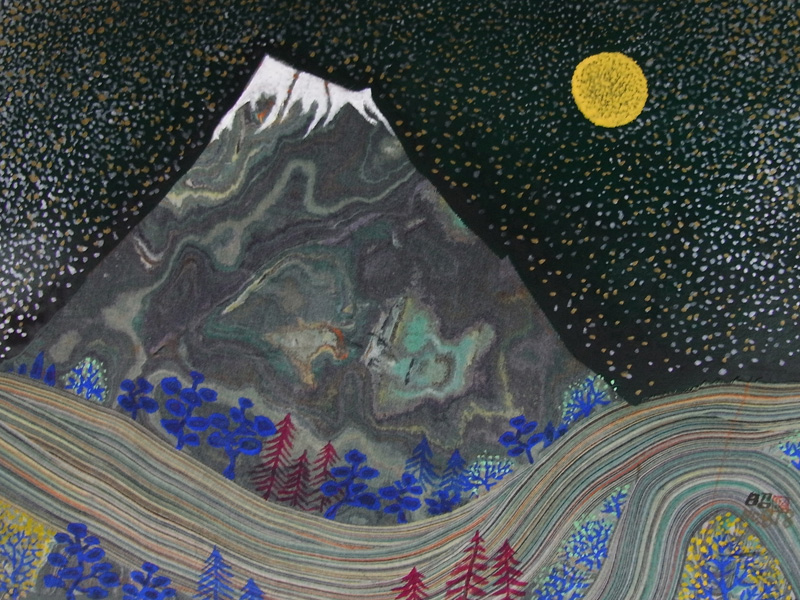
Born in 1936 in Shizuoka Prefecture where Mt. Fuji can be seen, Akira Ota has been drawing pictures of Mt. Fuji with watercolor.  He received many awards.  His depiction of Mt. Fuji is very dream like with lots of bright colors.  It is very interesting how he perceives Mt. Fuji.  I like "full moon and Mt. Fuji."  The contrast of yellow moon, blue/maroon trees, gray surface of the mountain, and the sky with full of stars is amazingly beautiful.  Swirling clouds give a quiet and bright night a movement.  I like this picture!


http://www.kaiga-afuto.com/contents2.html

Monday, March 12, 2012

Oil painting

It has been a couple of years since I learned oil painting so I forgot a lot of techniques that I had learned.  I could spend a lot of time in painting skulls, so I felt OK about the result; I feel I could have done better if I had spent more time even though I was not really interested in skulls.  Skulls would be the last object of my choice to paint; however, while I was painting them, they became just a simple object, not a living or dead being.  When I look at skulls, painted or photoed, they look alive and breathing, making me feel very uncomfortable.  I think that is why I don't like to look at the skulls.  It was quite a challenge to put aside this uneasy feeling and to try to paint, but it was very interesting to try to paint the shades of gray.

As for the quick paintings of the sunset in two methods, it was much harder since I really didn't have enough time.  First I painted all in one color and tried to add different colors.  When I was painting the base color, I thought it was much lighter and close to the color I wanted, but when it was dry it became pretty dark.  As a result when I tried to paint different colors, I couldn't really paint over the base color.  The second one is the same.  I thought the paint was dry the next day, but it was not really dry, so I had a strange mix of colors several times. 

The sunset oil painting project reminded me of my struggle to learn watercolor last semester.  I had to try many times to produce colors that I wanted.  I wasted many papers as I could not really paint over watercolor.  But I learned to like watercolor.  Hope I get used to oil painting soon.

Tuesday, February 14, 2012

Art in San Antonio

I visited San Antonio from February 9 to 12. I have been there several times, but this time I became very interested in their art.

JW Marriott where we stayed had southwest decorations everywhere. I was most interested in the color combinations of the floor carpet.   Blue, orange and tan are the main colors, representing sky, sand, and flowers (or sunrise/sunset).  Each color changes from light to dark with a few green and brown shapes here and there in a sutle way.  Somehow I was very impressed by the way the colors were mixed.  Shades of blue even reminded me of Hiroshige's blue.  Then I saw a sunset which was just like this carpet.

The hotel was also decorated with pottery; I learned the pottery is called Mexican Talavera pottery.  Talavera pottery was introduced to Mexico by Spanish people in the 16th century. About the same time the Spanish came to Japan and introduced their art to the Japanese.  By the way the first western people who came to Japan was the Portuguese in 1492.  Then Spanish and the Dutch.  As Talavera was Mexicanized, so are all the European potteries in Japan.  However, at the museums in Japan we can often find pottery which is just like original Talavera.

Japanese pottery is influenced by Chinese and Korean pottery, especially Korean when Toyotomi Hideyoshi invaded Korea in the 16th century.  They brought back Korean pottery makers so that they would make Korean pottery for them.  Korean pottery makers were forced to stay in several places in Japan, and eventually influenced Japanese pottery.

Hokusai and Hiroshige influenced the impressionists in the west.  Any culture does not stand by itself; they influence each other producing better art.

I also visited San Antonio Museum of Art. It has an extensive collection from around the world.  Their permanent collections include Egyptian, Greek and Roman antiquities, Asian art, Latin American art, American paintings and contemporary art.  I really enjoyed visiting this museum although I always wonder how these precious items from all over the world have become their permanent collections.  I wonder who donated them, how these people (foundation) used to own them. Did they purchase them while they were in foreign countries?  Right after the WWII when Japan was suffering from poverty, a lot of art items were sold by Japanese to Americans.  I have seen some of these arts at several museums. I enjoy visiting museums, but I cannot but think how and why these foreign art items have come to the possession of the museums. 

Sunday, February 5, 2012

Kappazuri-e: Stencil Prints in Japan

I am still trying to find what kind of stencil prints have developed in Japan.  I finally hit a couple of decent informational websites. 
http://www.viewingjapaneseprints.net/texts/topictexts/artist_varia_topics/stencil3.html
http://www.viewingjapaneseprints.net/texts/ukiyoetexts/ukiyoe_pages/nagahide4.html

Stencil printing is called kappazurie in Japan.  "The paper most widely used in Japan is called shibugami, made from several layers of kozo paper laminated with persimmon tannin."  We still use this kind of paper; actually I have a fan made from shibugami.  They make several screen prints just like woodblock prints according to how many colors they'd use.  They print from lighter colors to darker colors, and then the key impression stencil is used on the colored paper.  "If the stencil pattern has thin lines that can be reinforced with silk gauze." I reinforced thin lines by adding another sheet of paper. Information from the second website says stencil prints were used because they were less expensive and faster than the woodblock prints. It is hard to see the difference between stencil prints and woodblock prints!

By the way, I totally failed in the last try of the stencil print.  I was going to use the bubbles over the fall scene, but the bubbles wouldn't print on the painted eagle.  Also I somehow thought I could use the same bubbles, but the while acrylic on the bubbles came off and got stuck on my eagle.  If I had time, I will redo it, but (sorry) Sears repair men are coming with compressor on Tuesday, so I have to stay home again.  I liked the way the last stencil work turned out, so I will do it when I have time; I won't use the bubbles for the retry.

Yoshitoshi Mori

Wednesday, February 1, 2012

Mix media

We finished the first project, stencil.  I really enjoyed mix media.  In my mind, each medium used to be separate, and I have never thought about mixing them.  I had some resistance against mix media when I was working on watercolor last semester; however, with Dustyn's advice, I added acrylic to one paint and sumi to another one, and the result was so interesting.

In this class this semester, my first try on mix media was stencil.  Since I saw the result of mix media last semester, I didn't have any hesitation in mixing spray paint and acrylic on stencil (also sprinkles of silver dust).  We used all the requirements in this project, and the result was very satisfying.  The mix media give us a lot of freedom in expressing ourselves; I don't feel confined.  Mix media is freedom to the outside world whereas sigle media is freedom within the medium.  (Do I make sense??)

I went to an art show while in Japan, and most of them used mix media.  Since there was no explanation, I was not sure what they used.  I can now guess; oil paiting with spray paint and silver dust for one art.

I found a very "Japanesee" stencil as below.  I don't know who did it, but the color and design are definitely Hiroshige's.

Thursday, January 19, 2012

Stencil

I am behind in posting a blog.  I went to the first class thinking dropping it because of other projects I need to complete this semester.  However, when the plan was laid out, I became so interested in stencil and other projects I deciced to take the class.

I think I did stencil when I was a child; every child is exposed to some sort of cutouts.  However, what we are doing in class is absolutely reviving my brain to a new world.

As an image, I thought about a dragon (dragon year) and an eagle competing to go up the sky.  My second thought is to concentrate on the eagles.  The reasons are dragon images tend to be cartoonistic since it is an imaginary animal.  There are a lot of dragon images in Japan, but it might be a challenge to use them as a stencil.

When I moved to Batesville, I saw so many Black Vultures and Turkey Vultures.  I mistakenly thought they were bald eagles; I tried to find white head, but no avail.  I started surfing the web, and found out they are not bald eagles.  The place where we live was not called Eagle Mountain; the real Eagle Mountain is on the east side of this mountain.  There used to be a lot of goats on this mountain.  Lyon College used to own this goat mountain, but when it was developed for houses, they changed the name from goat to eagle; I guess eagle is more attractive than goat.  I'd say goat mountain is cuter, though. 

Bald Eagles can be spotted along the White River where not so many people live.  Bald Eagles migrate from north to south in winter; the closest place we can observe them is around Bull Shoals west of Mountain Home.

Anyway, I'd like to use eagles as an image for the stencil project.

Sunday, December 4, 2011

Preparation for the upcoming presentation

I have been working on the upcoming presentation.  The posts on the blogger are very useful.  I saves all of them in Word; 18 pages in total.  I am also putting together artwork I liked in books, online, and art galleries; after all these works have shaped my work this semester.  Come to think about it, it seems the artwork I saw in galleries have been influencing me since I started taking art classes a couple of years ago.

Book reviews we did, individual and group critiques, and critiques by Dan Hernandez and art students are very important assets to my work, too.  Hopefully I can include all the sources to my presentation.

Saturday, December 3, 2011

Tools

I am so happy that the art show downtown was so successful.  Congratulations to Dustyn and all.

I learned how to use tools such as the drill and drill bits this time.  When I opened the package from the American Frames, I just thought all I had to do was to lay the plexi glass, watercolor, mat board, and the styrofoam board in order.  When I read the instructions, I learned I had to use a drill to put spring clips.  I went to Wal-mart to find the drill, but I didn't even know what the drill looked like.  I tried to find a store attendant who could help me in vain.  Then I went to Home Depot where I could get a decent help.  The attendant took me to the right place and started explaining the tools, so I said all I want is a tool to put the frames together.  I got the drill; I asked him several times how to use it.  He said there are two screws, plus and minus (of course, these are my terminology), so I said I need something to make a hole.  Then he realized I need a drill bit.  I practiced how to drill a hole on a board; the drill bit wouldn't go in, and eventually I realised I turned the switch to the wrong direction, so instead of making a hole, the drill bit kept coming out. After several trying, I could put all frames and pictures together.

Monday night we hang pictures; Dustyn let me know sawtooth hangers are pulling the frame; the frame will eventually snap.  So I had to go to Home Depot and bought hanging wires and wire cutter.  Even at Home Depot a female store attendant didn't know what a wire cutter looked like, and she took me to a metal cutter section.  I said to myself if I had to use these huge cutters to cut the hanging wire.  She asked for another help.  Finally I could put all the wires on the back of the frames.

What a joy to see the pictures hang properly, and I did all by myself!  I can order more frames for the artwork I have done in the past couple of years.

Saturday, November 26, 2011

Sunrise

One of my four titles in my art project was the sunset.  The sunset is often associated with death as Turner and many other artists imply.  Just because I saw a beautiful sunset, I was going to use it as one of the themes, but I decided to try the sunrise instead as it implies the beginning of new life.  One of the art students suggested I use the ocean since I crossed it to come to the States.  I have seen both the sunrise and the sunset from the plane many times, but since my topic is "Big Sky" in the States seen from the ground, I decided to search an image of the sunrise at the Mississippi; I have crossed it many times.  This weekend I am working on this sunrise, and hopefully it will turn out as I hope.

Sunday, November 13, 2011

The Sublime

The Introduction

"The essential claim of the sublime is that man can, in feeling and speech, transcend the human.  What, if anything, likes beyond the human - God or the gods, the daemon or nature - is matter for treat disagreement. (Thomas Weiskel. The Romantic Sublime: Studies in the Structure and Psychology of Transcendence. 1976.)

Sublime in 18th century: "The concept of the sublime . . . was applied in relation to the art to describe aspects of nature that instill awe and wonder, such as mountains, avalanches, waterfalls, story seas or the infinity vault of the starry sky."(12)

Today:"The incredible power of technology is more likely to supply the raw material for what can be terms a characteristically contemporary sublime." (12)

Rosenblum, Robert. "The Abstract Sublime" 1961

Among all the articles under "Nature," I was most interested in Rosenblum's "The Abstract Sublime" as it deals with Turner's work.  He quotes Kant's definition by saying the Sublime is to be found in a formless and boundless object.  Then Rosenblum discusses James Ward and Clyfford Still's art.  Both of them portrayed nature in large canvases; the one described in his article is 131x166 cm by Ward and 113x159 by Still.  These are representative of sublime landscape which portrayed awe, terror, boundlessness and divinity during 18th and early 19th centrury; as a result the viewers were often awed by the void in such boundless and vast nature.

Turner, however, expresses Sublime by filling the void with cosmic energy such as steam, wind, water, snow and fire.  The author continues to discull Turner's contemporary, John Martin (1789-1854).  Then the author brings Jackson Pollock (1912 - 1956) as the third master of the Abstract Sublime. "That brink is again reached when we stand before a perpetuum mobile of Jackson Pollock, whose gyrating labyrinths re-create in the metaphorical language of abstraction the superhuman turbulence depicted more literary, in Turner and Martin." (111)

AS the fourth master of the Abstract Sublime, the works of Barnett Newman (1905-1970) are introduced.  He explored "a realm of sublimity so perilous that it defies comparison with even the most adventurous Romantic exploration into sublime natioe."  Newman drew "Vir Hericus Sublimis," which is 114.5 inches. 

Honestly speaking, I have not seen the real works by Martin or Newman; it is impossible to capture the impression of paintings which are just several colors of red and a line.  But I try to picture a huge painting with only a few colors in front of me, I will just feel lost in its simplicity.


Marley Simon. Ed. The Sublime: Documents of Contemporary Art. London: Whitechapel Gallery. 2010.

Turner: The Fighting Temeraire

J.M.W. Turner (1775-1851) named his painting as "The Fighting Temeraire tugged to her last berth to be broken up."  But when it was displayed at a museum, the title was shortened.  Turner painted this oil painting in 1838.  The ship was made in 1798 and was dismantled in 1838.  The art was complimented as "the most wonderful of all the works of the greatest master of the age," "a nobly-composed poem, very poetical conception."
Turner didn't witness this 2,110-ton ship being tugged to be dismantled.  He painted the ship from imagination; however, he did paint four other works based on the Temeraire.  The motif of picture came from a steam boat tugged on the Seine. The paint is 90.7x112.6cm, rather a large painting, but smaller compared to other landscapes during 18th century.

The Temeraire was in the Battle of Trafalgar in 1805, which brought the glorious victory to the Britain. When the ship was tugged, some of the equipment on the ship had been already taken out; only three bare masts without sail remain.  Absolutely vacant space on the ship symbolizes the fact that the ship has completed its role.  The ship looks almost ghostly.  The original colours used for the ship were yellow and black, but there are no such colors left on the ship in the painting.  The glorious looking sunset also symbolizes the destiny of the Temeraire; at the same time it relates to a death of human.

By the way, Turner is the first person to use "tug" as a verb according to the OED.  "Towed" was used before Turner.

My comment: left side of the painting depicts the Temeraire tugged by a dark tug boat.  The tug boat looks like a fate because of its dark color.  Behind the tug boat are two ships with sails, which symbolized they are still active, but eventually they are going to follow the step of the Temeraire.  Ont he right side of the painting is this beautiful sunset.  It it stands alone, I don't associate it with a death of the ship/human. But, with two images together, however the beautiful the sky (ship) is, it has a straightforward message that the glory is going to end.

Egerton, Judy. "Making and Meaning: Turner-The Fighting Temerarire. London: National Gallery Publications. 1995.

Georgia O'Keeffe

I had a glimpse of Georgia O'keeffe's "Sky above Clouds" this morning.  It is clouds below sky, but it would be beautiful if I can capture the essence of this sky in watercolor.  I'd like to challenge  transforming this kind of picture into a painting because the complementary colors exit in this picture.

Group Critique by Dan Hernandez

I was very nervous about what Dan Hernandez was going to say about my watercolor in his critique, but rather I felt his critique gave me a direction to complete my watercolor project.  It was my plan to include a water tower with the stormy sky.  I practiced how to paint the stomy sky many times, but I was not sure how big the water tower should be.  When I was introducing my watercolor to him in the group critique last week, I commented on my first impression of the water tower when I came to the States; it was an out of ordinary shape and it looked like a space ship.  I have seen many water towers since then, some look like a tin man from the Wizard of Oz, some just a ball (not scary), but the type I see in Beebe exit to highway 64 really looks like a spaceship.  I think that is the type I saw when I came to the States (Iowa) first time.  I was glad to hear when Dan suggested I should paint the watertower large.  I was stuck with the idea of painting something very small and flat on the bottom of the paper, so with his comment I could finally free myself from the tedious drawings on the bottom of the paper.

Wednesday, November 9, 2011

Try, error, try, discover

They sounds so cliche, but this is what I have been going through while trying to learn how to use watercolor.  After many trials, I finally realized how to erase lines when I paint the paper with the same color.  I just picked up the paper, and hang it from my hand from one side to another side.  The dark color on the light color created an interesting effect.

I was using paper towel, tissue paper, towels, and different kinds of brushes so that I can draw puffy clouds, round clouds, stormy clouds; I had to remove a piece of hair from the brush with paper towel, and accidentally found an interesting effect on the paper.

I was not satisfied any dark watercolors; I was using sumi for something else, I decided to try it, and it worked a lot better to portray evening view of the background.

After try and error, I finally mastered to use the masking fluid; however, I don't really care for its effect; I don't like its smell, either.

Hake is really useful; I use it not only to wet the paper but also to paint.  It holds a lot of watercolor at a time, so I don't have to go to the pallet to fill the brush. 

Japanese sumi-e brushes are a lot more resilience; the ones I am using are made of rabbit hair.  I use the ones with horse hair for writing, but I might try horse hair for watercolor.

As I challenge watercolor, I find more interesting ways to maneuver it.  I finally feel I enjoy painting with watercolor; I do not hesitate as much as I used to.

Thursday, November 3, 2011

Home studio

Earlier this semester we read "Inside the Painter's Studio."  This semester I have been using my dining table at home as a studio.  I have pros and cons about using home as a studio as these artists have discussed in their articles

I like to work at home since I can work on watercolor any time I want to till late into the night; however, I have to look at my work constantly asking myself what can be done to improve it.  There is no break from my painting; I am always reminded of the work I need to do.  (I tend to forget things, so this constant reminder might be useful, but I would like to have some time out once in a while.)

I would appreciate the feedback from my classmates if I were working in the Alphin studio; on the other hand, I would like to think through by myself to solve certain problems without being influenced by others.

More pros and cons, but right now I'd like to get back to my painting; the stormy wind outside tells me to get back to my work!

Tuesday, November 1, 2011

Arches Watercolor Block

I have been practicing painting clouds almost every evening on 9x12 watercolor paper.  I learned some techniques from Karen Jensen, sumi-e artist, so I tried some of them.  Alum works on washi as resist, but I am not sure if it is working on watercolor paper. I will try other techniques when appropriate.

I finally received Arches watercolor block last Wednesday, but I didn't get a chance to try it.  I was just so afraid to ruin expensive paper.  Today I challenged painting on Arches watercolor.  I really like it; the paper does not buckle! The color is absorbed by the paper evenly.  The brush moves very smoothly on the paper; when two colors touch, they blend nicely.  However, the pen I used to draw rough sketch on the paper does not disappear, so I cannot use it anymore.  Oh, well.  Hopefully I will have a few pictures ready by next November 10.

Dustyn, you implied I should use better paper; I agree with you.  I like Arches!